Karan Singh Bhatoa

Casa Palette
A streamlined home décor app with intuitive navigation and categorized shopping

Overview
Casa Palette is a home décor app and website designed to simplify the process of browsing and purchasing furniture and décor items. The project focused on creating an intuitive, user-friendly interface with clearly defined categories like tables, sofas, beds, chairs, lamps, and mirrors. In just 5 weeks, I designed a visually appealing platform with a seamless experience for both mobile and web users.
Key features include customizable filters, personalized inspiration sections, and a clean, modern layout to enhance usability. By focusing on user needs through interviews and testing, Casa Palette improves engagement and shopping convenience.
Problem
Home décor enthusiasts struggle to find an intuitive, categorized platform to explore and purchase furniture and décor items. Existing platforms often lack proper categorization, have cluttered designs, and do not offer a seamless user experience for mobile and web users.
Casa Palette seeks to solve these problems by providing a better interface with distinct categories and an enjoyable shopping experience.
Goal
To create an intuitive, visually appealing, and functional home décor platform where users can browse, search, and purchase items. The design focuses on creating a seamless experience for different categories like tables, sofas, beds, chairs, lamps, mirrors, and more.
Key Objectives
-
Enhanced User Interface (UI): Build a modern, visually pleasing design.
-
Category Segmentation: Clear categorization of products such as tables, sofas, beds, chairs, lamps, mirrors, etc.
-
Seamless Navigation: Intuitive navigation on both app and website to improve user experience.
-
Consistent Design Language: Maintain consistency between mobile and web platforms.
-
Customizable Filters: Allow users to filter by price, material, size, and other preferences.
-
Inspiration Section: Incorporate a section with design inspirations for each room or furniture category.
Research
User Interviews & Surveys
We conducted interviews with 6 potential users, including home décor enthusiasts, and homeowners. We gather feedback on pain points, existing app preferences, and design expectations.
Key Findings:
-
Users often abandon a site if they can’t quickly find the category they’re looking for.
-
Filtering options are critical—price, material, size, and color must be easily accessible.
-
Users appreciate a design inspiration section for ideas.
-
Desktop users want easy-to-read text and well-organized grids; mobile users need a minimalistic and fast interface.
Design Process
1. Information Architecture (IA)
We started with the IA to define the app and website structure. The goal was to create a simple and intuitive navigation flow for both platforms.
-
Homepage: Highlights featured categories by products (tables, sofas, beds, lamps, mirrors, etc.), room (living room, bedroom, kitchen and offers and deals), popular products, and promotions.
-
Product Categories: Segmented into specific types of furniture and décor.
-
Filters & Search: Easily accessible search bar and filters on every product page.
-
Product Details: Detailed information on material, dimensions, and shipping, with large imagery.
-
Favorites & Cart: Allows users to save favorite items or add them to their cart.

2. Wireframes
After defining the IA, we created low-fidelity wireframes for both the app and website to map out the layout. This helped us visualize the structure and iterate quickly.
Key Screens:
-
Homepage (Products and Rooms)
-
Product Category Pages (Table, Sofa, Bed, Chair, Lamps, etc.)
-
Product Details Page
-
Cart & Favorites
-
Sale Section
Mobile Wireframes:
Focused on simplicity and ease of navigation, with a bottom navigation bar for quick access to categories, favorites, and cart.


Key Features & Design Components
1. Homepage
-
Carousel Banner: Highlight promotions or trending items.
-
Navigation: Prominently displayed buttons for living room, bedroom, kitchen furniture, etc.
-
Popular Items Section: Displays the most popular décor items, personalized to user browsing history.
2. Product Categories
-
Grid Layout: Products are shown in a card-based grid for both mobile and web versions.
-
Quick Access Categories: Prominently displayed buttons for tables, sofas, beds, chairs, lamps, mirrors, etc.
-
Filter & Sort Options: Filters for price, size, color, material, and Pickup availability. Users can sort products by popularity, price, and new arrivals.
3. Product Detail Page
-
Product Images: Large images with a detailed viewing.
-
Price & Discounts: Clear pricing, including any discounts.
-
Product Specifications: Material, dimensions, shipping information.
-
Add to Cart/Favorites: Prominent call-to-action buttons.
4. Checkout Process
-
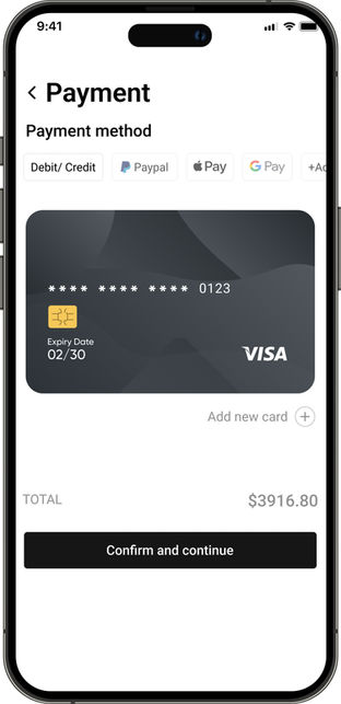
Checkout: Users can check out without creating an account.
Usability Testing & Iteration
Testing Process:
-
We conducted 5 usability tests with a mix of mobile and web users.
-
Focused on task completion times, ease of navigation, and overall satisfaction.
Findings:
-
Users loved the clean, intuitive category segmentation.
-
Filters were highly praised for being easy to use.
-
Some users felt the homepage had too much content and recommended reducing the number of sections to make it more scannable.
Iterations:
-
Simplified the homepage to highlight top categories and reduced the number of sections.
-
Improved product filtering by making it sticky on the product listing pages for easier access.
Results & Key Takeaways
Positive Metrics:
-
Bounce Rate: Decreased by 20% on both platforms.
-
Conversion Rate: Increased by 15% after the redesign, with many users citing the improved UI and better organization as reasons for ease of shopping.
-
Customer Satisfaction: Post-launch surveys showed a 30% increase in satisfaction due to the design inspiration section and easy navigation.
Key Learnings:
-
Creating clear product categories with detailed filtering options is crucial in e-commerce.
-
Consistency across web and mobile interfaces greatly improves user experience.
-
Listening to user feedback early in the process helps avoid pitfalls later on.


